How to choose the right logo?
The image of any brand is a logo, by which the user recognizes the company, understands its field of activity and understands its core values. Even the simplest graphic symbol can build a strong connection with the customer base and set up communication.
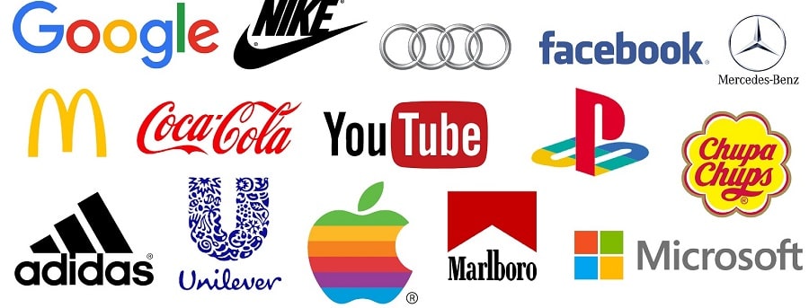
But there are some points that deserve special attention. For example, it’s worth figuring out why certain logos are familiar and stand out from the thousands, while others just go by the wayside. For example, if you say apple, you immediately associate it with Apple. So you have to think it through to the smallest detail, and that will help you succeed.
How does a logo promote a company?
Numerous studies in marketing and advertising suggest that every day the average person sees around 3000 advertising messages. That’s a huge flow of information, social media, mail and messengers. Different brands offer their own products and services everywhere, and a logo in promotion is an important aspect.
In most cases, a good logo is a kind of business card. And it takes a little time to get an impression of the company. And a striking visual image can influence customer behaviour.

How to make the right choice?
At the moment, there are several most common types of logo:
Text. This is the most in-demand option, and companies of all types use it. Succinctness and simplicity are the main factors. Depending on the requirements and trends can change the stylistic performance and font, and thus update the appearance. This variant will be the right solution in case the name consists of a couple of words or there is no possibility to translate it into an abbreviation.
- abbreviation is a good solution for the logo, especially if the company name is long. For example, NASA looks much better, while a full name does not even make sense, it is a force of habit.
- Symbolism. A visual representation of a brand in a single icon, this again applies to Apple. But this kind of logos may well be abstract or even hand-drawn, photorealistic, etc.
- abstraction. This is ideal when you want to use an image without being bound to a particular image. Regardless of the type of business, you can use this solution.
- Mascot. Playful and interesting images are often remembered and stand out among the masses. The essence of this lies in psychology, i.e. the human brain reacts much better to a human face. And among the main advantages of the mascot is adaptability. For example, the brand has undergone some changes, but it is always possible to make revisions to the logo without any harm.
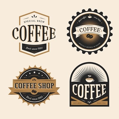
- Coat of Arms. This option includes both text and a visual component. It is one of the ancient variants, which is often used for universities or government agencies.
- Combined versions. This can include both images and text. That is, it is maximum clarity for the client and emotionality, all complementing each other.
